My latest photography assignment was on color and color theory. I had to go out and shoot photos for specific prompts: monochromatic, complementary colors, analogous colors, warm tone, cool tone, etc.
Monochromatic
September 2020
Monochromatic is an image/art piece/etc. that utilizes one color. It can be any color, but the photos I chose for this prompt were all on the gray/black end.


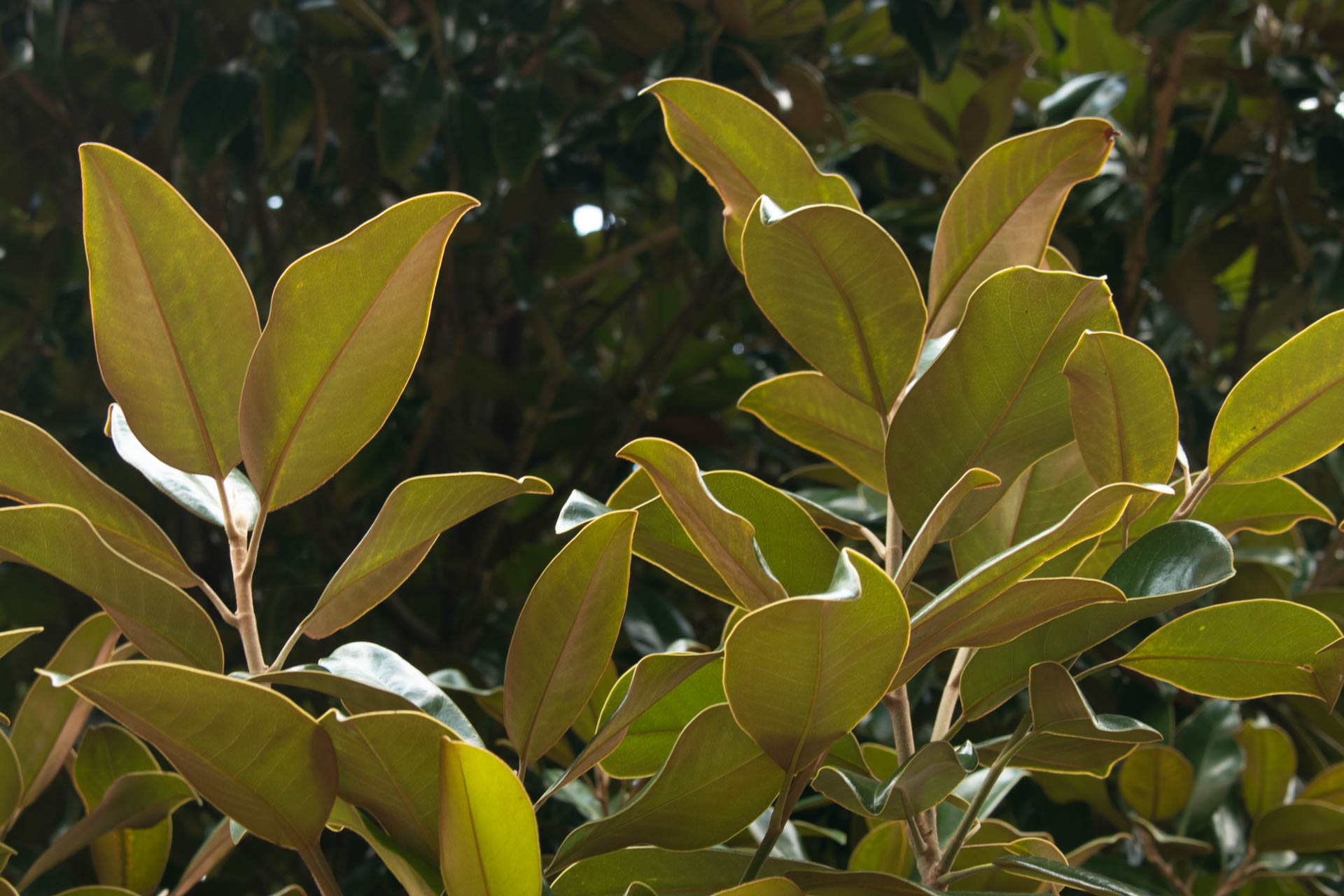
Analogous
September 2020
Analogous colors are colors that are next to each other on the color wheel. For ex: red, orange, yellow. My images for this were green and blue because my university campus is kind of analogous color-wise as a whole.

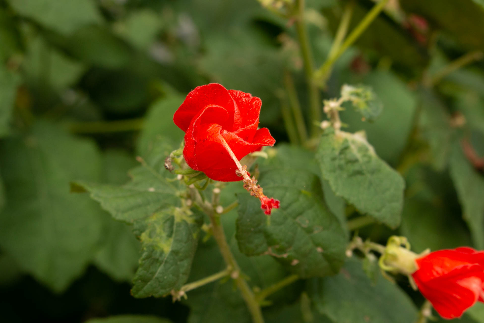
Complementary Colors
September 2020
Colors that are opposite each other on the color wheel are considered complementary. Think red and green. When complementary colors are put right next to each other, they pop out much more than they would separately. I only have one image for this one, but that’s ok.
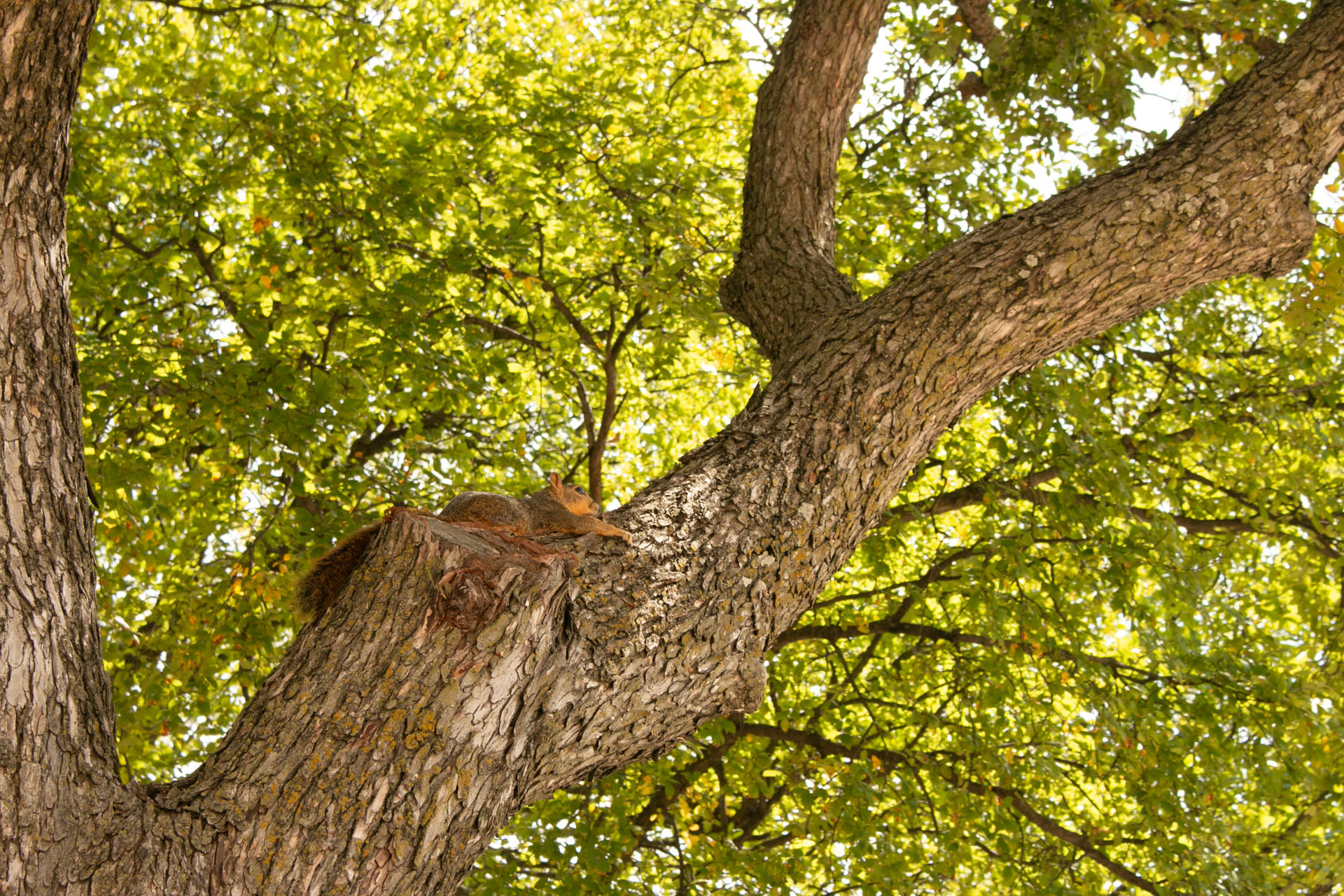
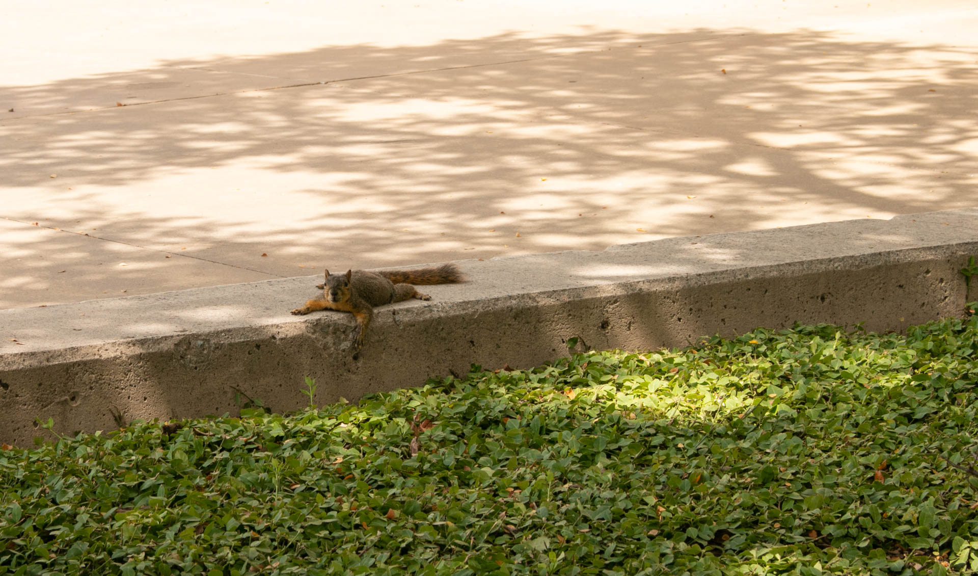
Warm tones
September 2020
Colors like yellow, orange, yellow-green, red, etc. are considered warm. The squirrel pictures I have to the right are actually the original lighting/coloring of the photos in my last post about editing. These are what those photos looked like before I edited them.

Cool tone
September 2020
Colors that are on the cool tone side of the wheel are opposite to the warm colors. Blues, darker greens, purples, etc. are colors that are more associated with coldness/coolness which makes them cool colors. I also only have the one picture for this prompt, but that’s ok.

Equipment: Canon 70D DSLR, 18-55mm EFS Lens
Photos are unedited, however I do edit using Adobe Lightroom Classic


